Is Your Website ‘Mobilegeddon’ Ready?
You may have heard the news that Google unveiled a major change in their algorithm today that will impact even the biggest brands’ search results. This change, which aims to give “mobile friendly” sites higher search rankings, was announced in February to allow for website updates. So what exactly is a “mobile friendly” website?
Mobile friendly sites are designed with:
- Large text
- Easy to click links
- Responsive design, meaning the pages respond according to the screen size of the device
- Smaller image file sizes
Why would Google make this change? Reportedly mobile searches accounted for nearly half of all Google traffic from June to November 2014. According to research company, eMarketer, the number of US mobile users has grown from 34 million in 2010 to more than 134 million in 2014.
Still, this is just one in a list of roughly 200 characteristics that make up the closely guarded Google search algorithm, but it is a wake-up call. Mobile adaptation should not be ignored. If you are concerned that your site isn’t ready for ‘Moblegeddon’ Google has provided a quick-check tool. Type in your URL on the Google “Mobile-Friendly” test page and view the results.
If you find that your site needs a refresh, Caliber is here to help! We invite you to explore a few of the responsive sites we’ve helped create for our clients.

Hughes Federal Credit Union

Pasadera Behavioral Health Network

Pro*Act
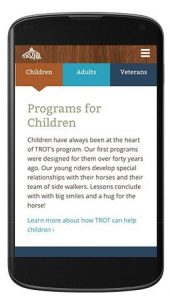
Therapeutic Riding of Tucson
We’ve been predicting the mobile-centric shift since 2011! Read about it here.
Contact us for help communicating with your stakeholders, managing this crisis, or preparing your business contingency plan.
"*" indicates required fields